The platform brings the A/B testing process from scattered tools into one working system: hypotheses, owners, parameters, statuses, overlaps, metrics, teams, and launch decisions stay in one operational flow.
AB Platform
Internal platform for visualizing and tracking the performance of product and technical hypotheses.
The platform brings the A/B testing process from Jira, spreadsheets, BI, and engineering tools into one product system: setup, planning, overlap checks, metrics, owners, integrations, and launch decisions.
Status
Release
Role
Product Designer
Domain
Experimentation, Analytics, Internal Tools
Product model
System
The main scenario joins two operating views of the same experiment system.
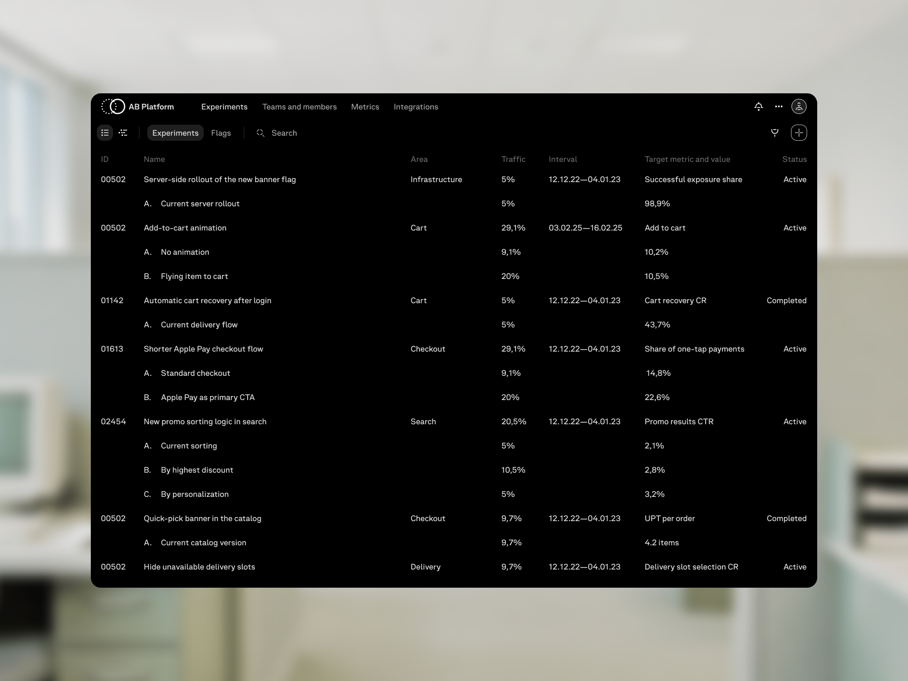
The list shows experiments as rows with ownership, metrics, timing, and status. The timeline shows the same tests as intervals in a shared plan.
Opening an experiment brings its state into the side panel: the user can pause the test, select the variant to roll out, and apply the decision without leaving the platform.
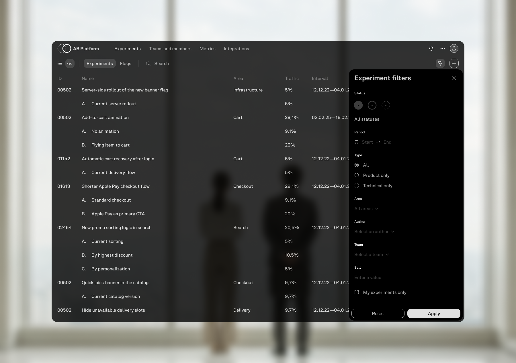
The table view is built for scanning existing experiments. Each row carries the experiment ID, name, product area, traffic, interval, target metric, current performance, and status.
Visual language
The visual language is built for a service where statuses, tables, side panels, forms, icons, and technical states have to read clearly in light and dark themes.
Mark
The mark comes from the status indicators used in the product interface.
Outlined, dashed, and filled circles describe different stages of an experiment. The logo uses the planned and active states, so the identity is tied to the same indicators that appear in the platform.
Components and icons
The component library keeps the experiment platform visually consistent across working screens.
Tables, side panels, forms, statuses, controls, icons, and utility states are designed for both light and dark themes, so lists, test creation, timelines, and service screens follow the same visual rules.
Workflows
The workflow follows the experiment lifecycle: create the test, put it into the shared plan, watch the metric performance, choose the winning variant, roll it out, and return to the completed experiment when it needs to be edited or repeated.
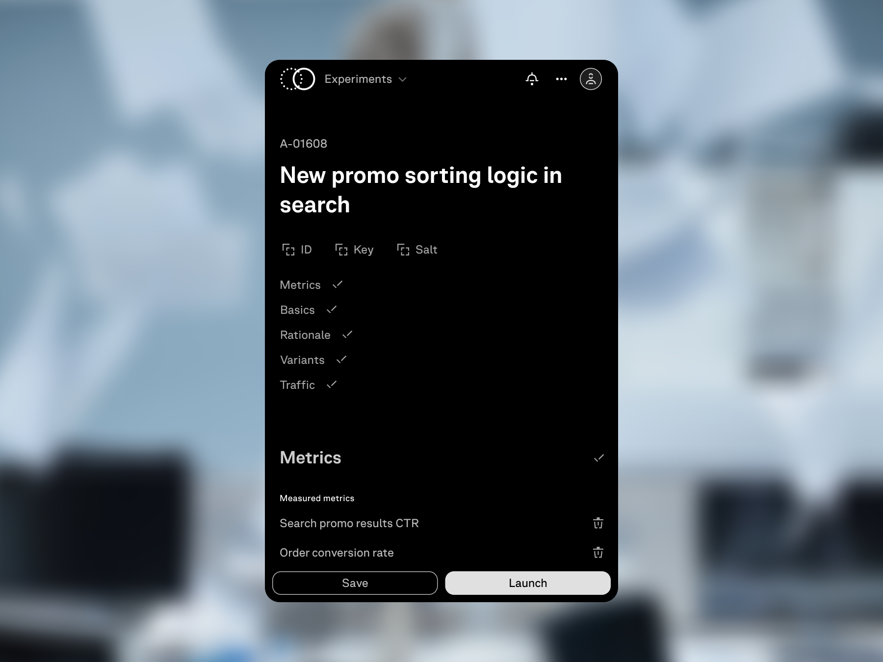
Test creation
The creation page gathers the experiment into a structured setup: name, hypothesis, audience, variants, traffic, buckets, dates, metrics, and decision criteria.
The left side keeps navigation through the form sections; the right side keeps draft saving, launch, and overlap checks next to the setup.
Saving keeps the experiment as a draft outside the shared timeline. Launch assigns the scheduled or active state depending on the selected dates.
The filled setup shows that all required sections are ready. Until mandatory fields are completed, the launch action stays unavailable; after validation, the user can save the draft or launch the experiment.
Timeline
The timeline adds a visual time axis to the experiment list.
The same tests that appear as table rows become blocks on dates: the user sees where each experiment starts, how long it lasts, and which other tests fall into the same interval.
The row height stays aligned between list and timeline views, so switching between them does not reset orientation in the experiment set.
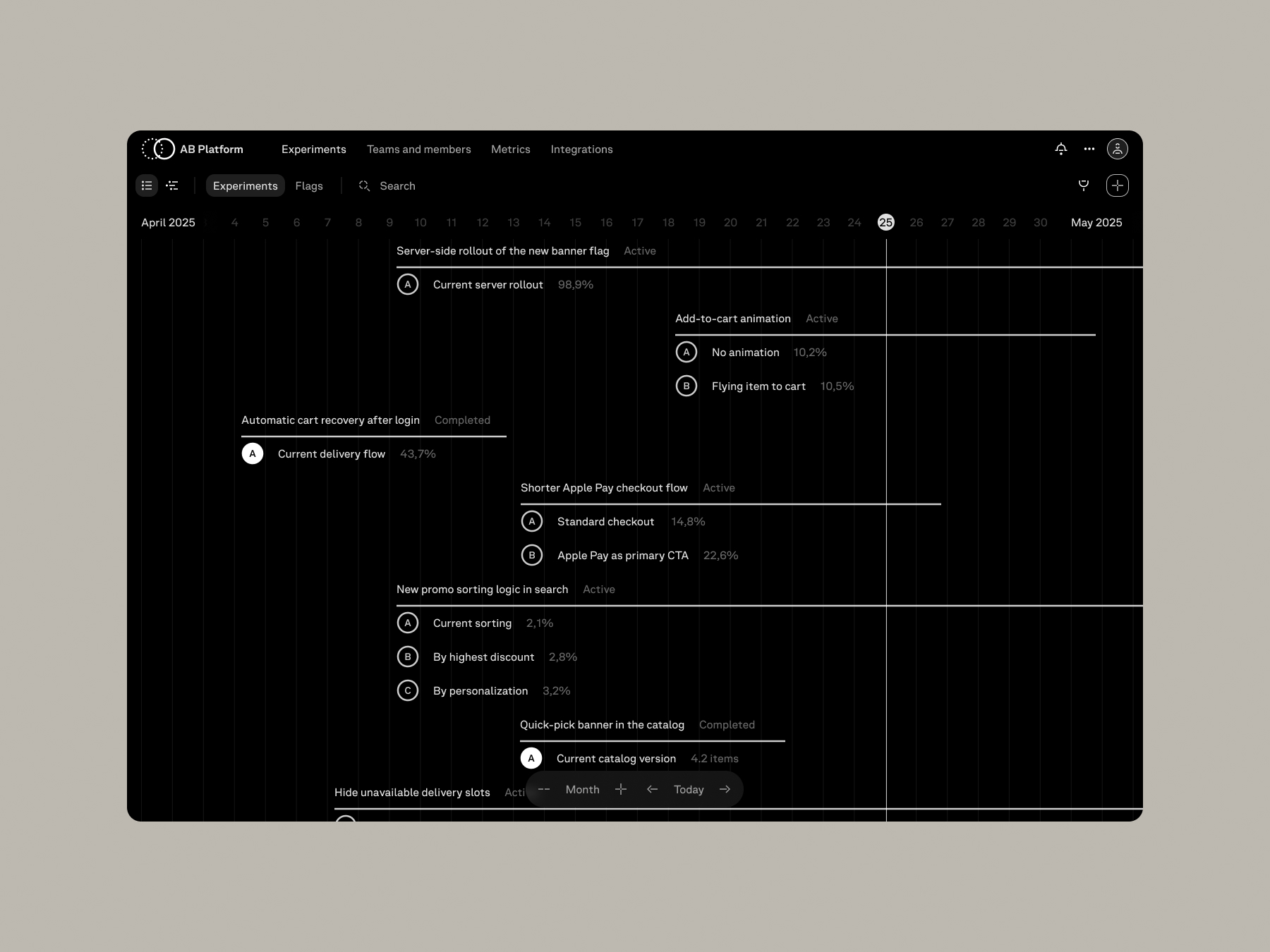
The timeline can be navigated in two directions: across dates and through the experiment list. This makes it possible to inspect long periods and crowded intervals while keeping the shared time context visible.
System logic
System logic helps teams make a launch decision before an experiment touches production data. Overlaps, teams, integrations, metrics, filters, notifications, and update history show who is responsible for the test, what it affects, and what changed in the product.
Overlaps
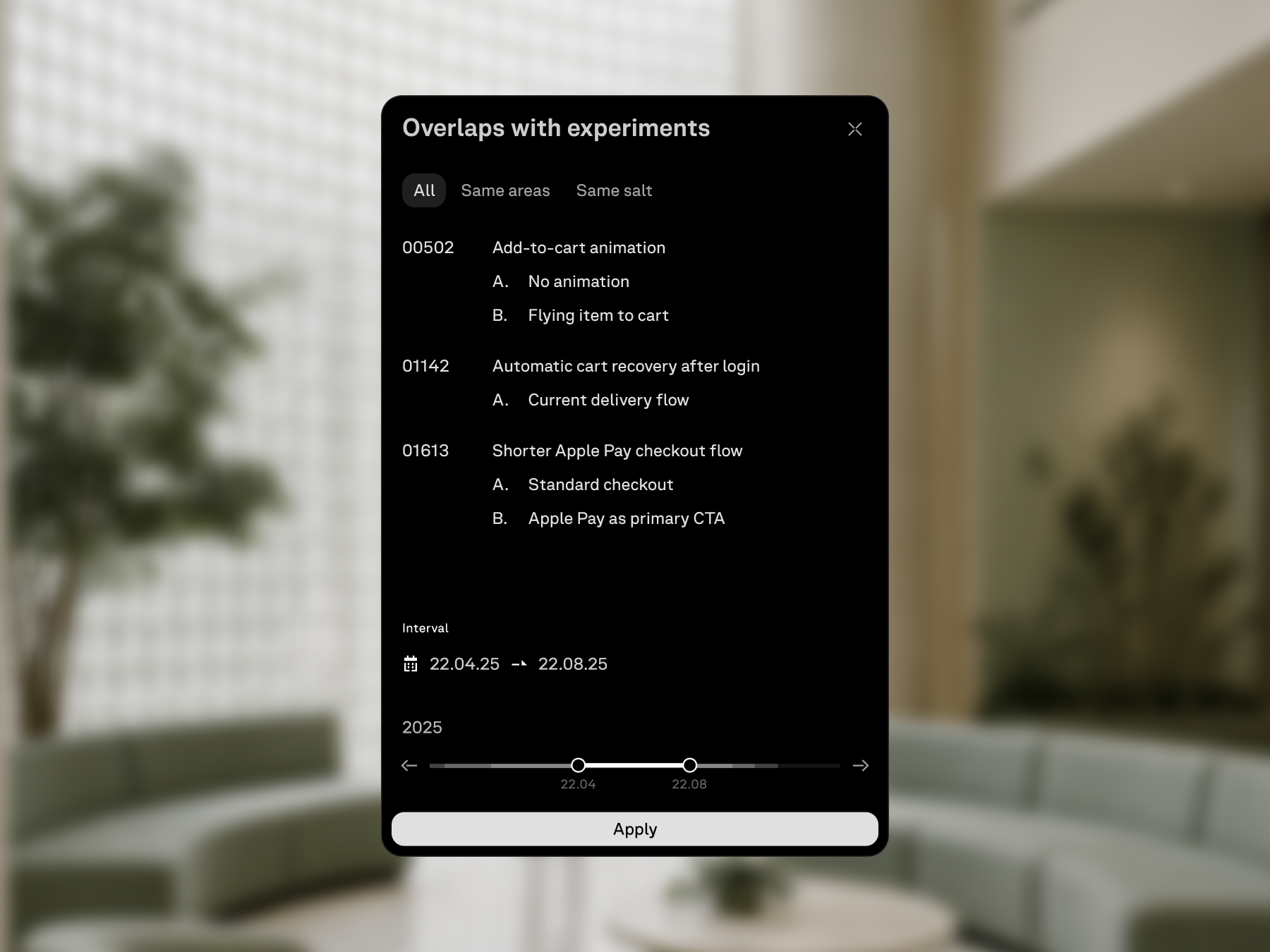
Overlap control checks the selected experiment interval before launch.
The modal shows the dates from setup, experiments that intersect with them, and a compact load graph. Each transparent segment marks a scheduled test; stacked segments make overloaded periods brighter, so the user can see risky intervals and open conflicting experiments directly.
The experiment list can be filtered by working parameters: status, product area, dates, owner, metric, traffic, and other fields available in the platform view.
Ownership
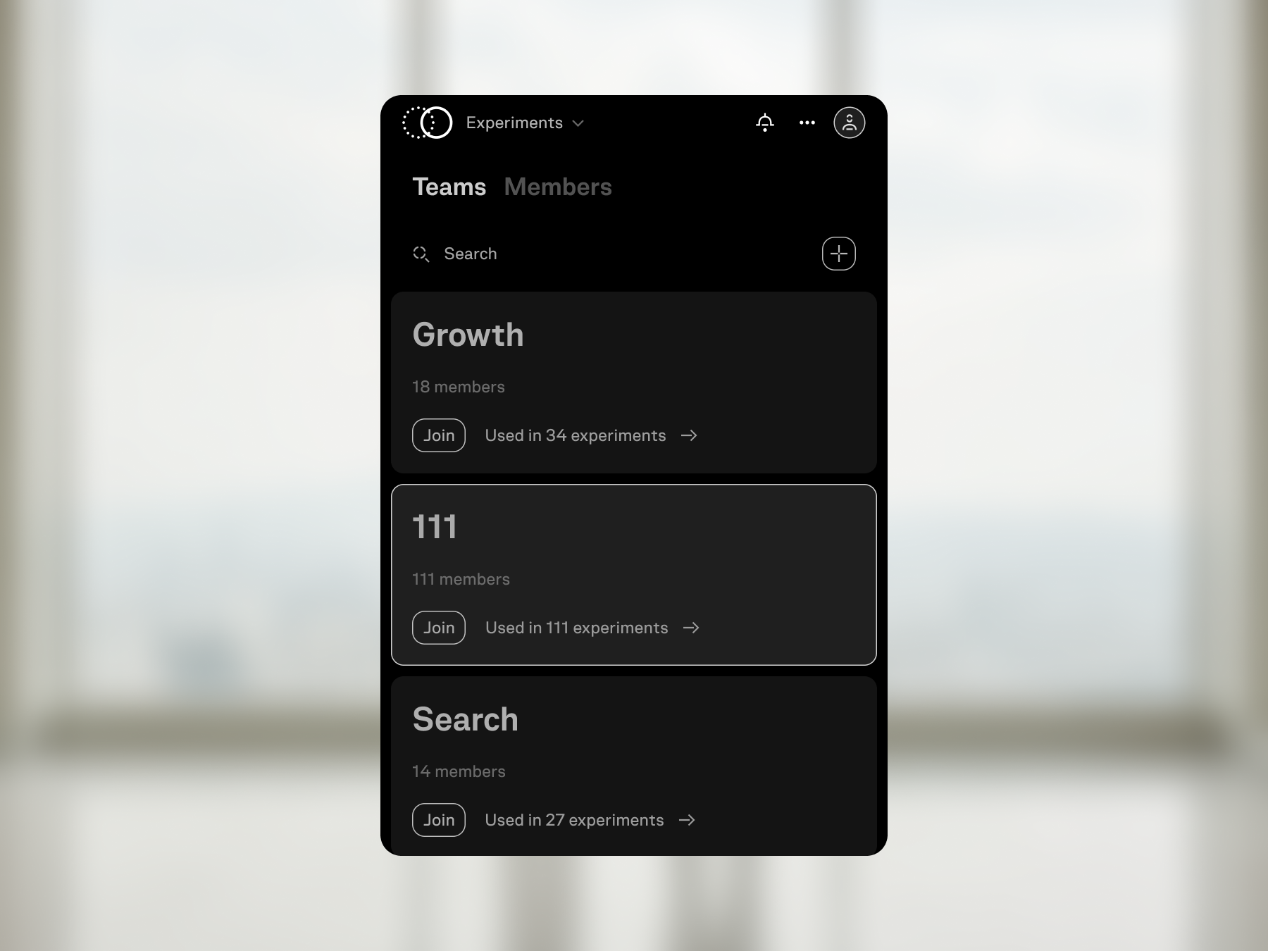
Every experiment has an owner context: teams, members, services, integrations, and the list of experiments connected to a team.
The Teams and Members section shows who launches tests, which experiments a person owns or joins, where membership requests are approved, and how service integrations are attached to a team.
The mobile view keeps the team list readable as a compact operational directory.
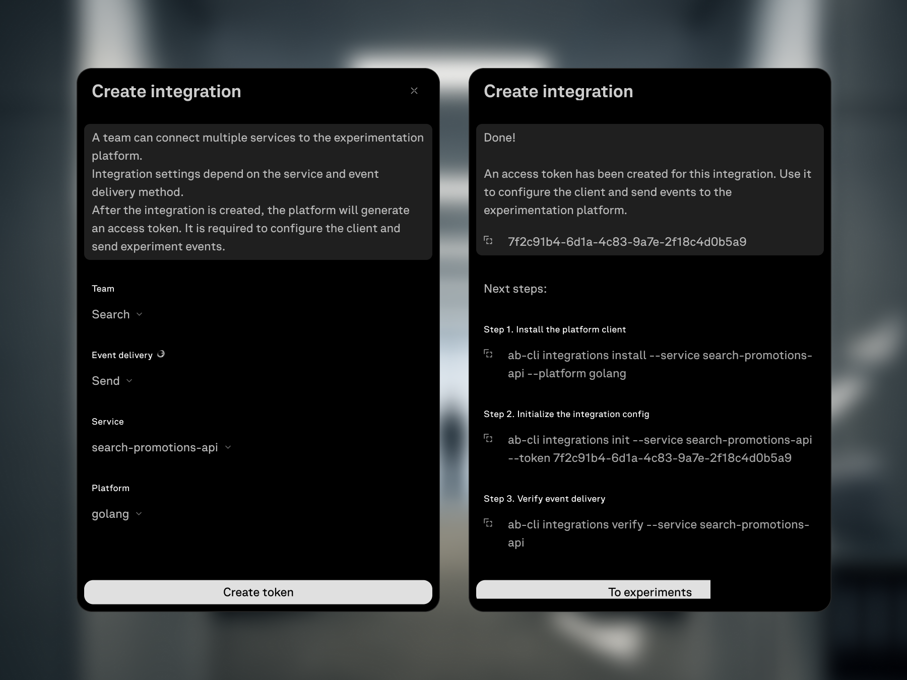
Integration settings give the engineering team a concrete connection path: choose a team, service, and platform, generate a token, then follow the installation, configuration, and event-delivery checks shown in the same modal.
Metrics
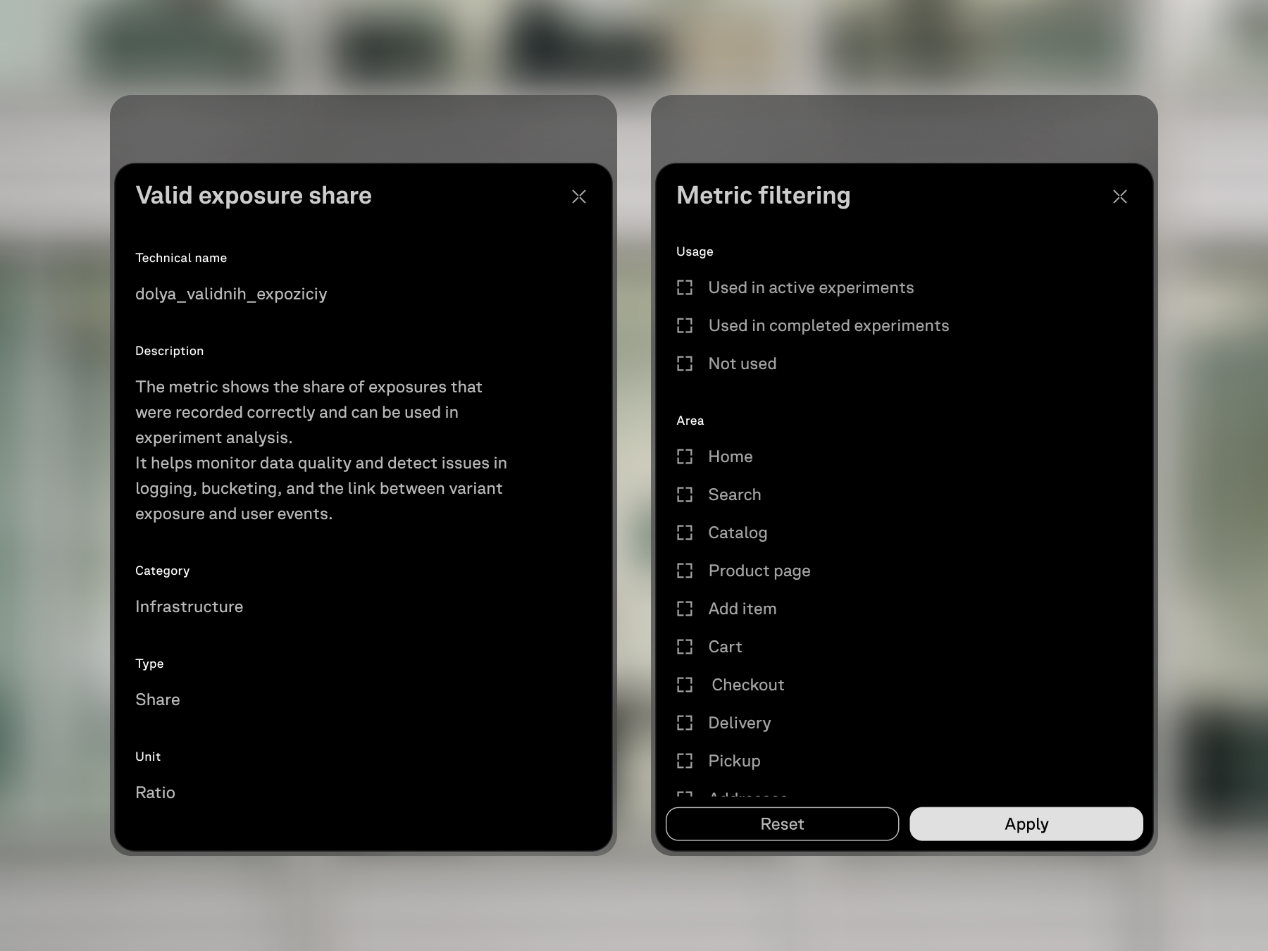
Metric selection belongs to the experiment setup and uses a shared metric catalog.
The modal groups metrics, supports selection, and opens a metric card with technical name, description, category, type, and unit. The experiment references a common definition, so the meaning of a metric does not have to be rewritten in every test.
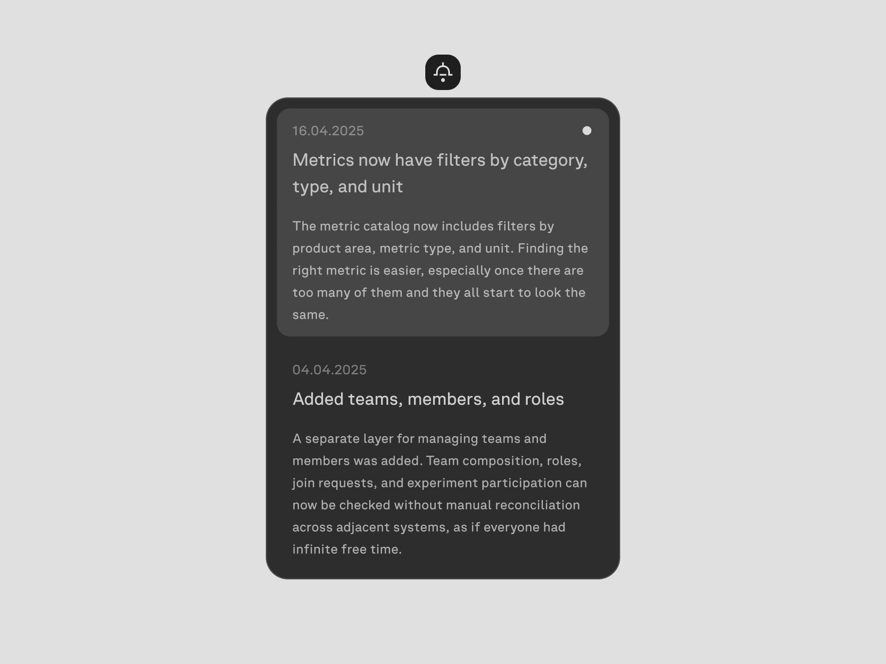
Platform updates are surfaced through the notification button. Opening it shows the latest changes and lets users read what was added or changed without looking for a separate announcement.
After an experiment is completed, the same page remains useful as a record of the test. The user can scroll through the configuration and results, then edit the setup or run the experiment again from the completed state.