1.1
Construction
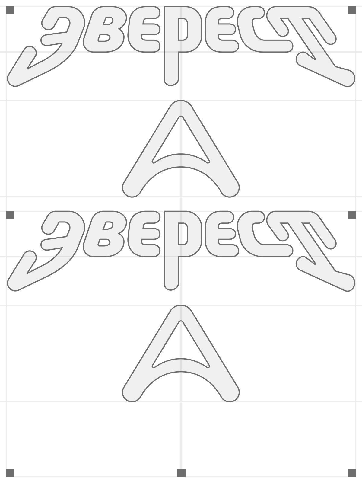
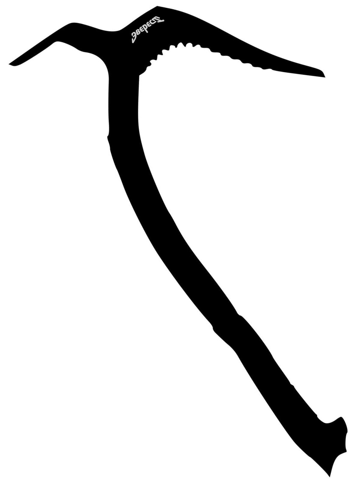
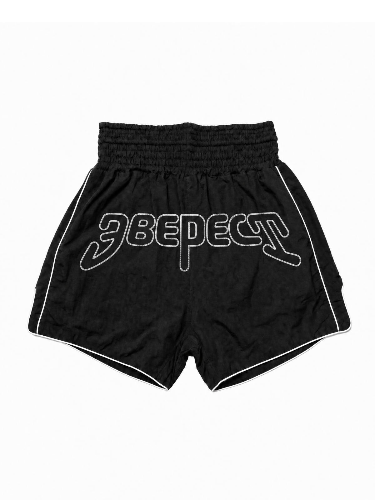
The lettering is custom: the diagonal tails of Э and Т work as ice-axe hooks.
The mark is a peak arrow built on the letter А. It always points up.
Everest is a combat sports club in Izhevsk with eight disciplines — from boxing and MMA to judo and kobudo.
The identity is built on the metaphor of an ascent. The Everest lettering grips the lines with ice-axe hooks; the mark is a peak — an arrow that always points up; every training session is altitude gained, and the path through the club is a route to the summit. The color palette is adapted to high altitude: charcoal, snow, sky, and signal orange. The visual language is built on print-shop texture — monospaced type and crop marks become the medium for a narrative unfolding through the leitmotifs of mountaineering and old-school boxing.
Hold the altitude.
The name sets the altitude — the system holds it. The lettering and the mark are built on one gesture: upward movement.
The lettering is custom: the diagonal tails of Э and Т work as ice-axe hooks.
The mark is a peak arrow built on the letter А. It always points up.
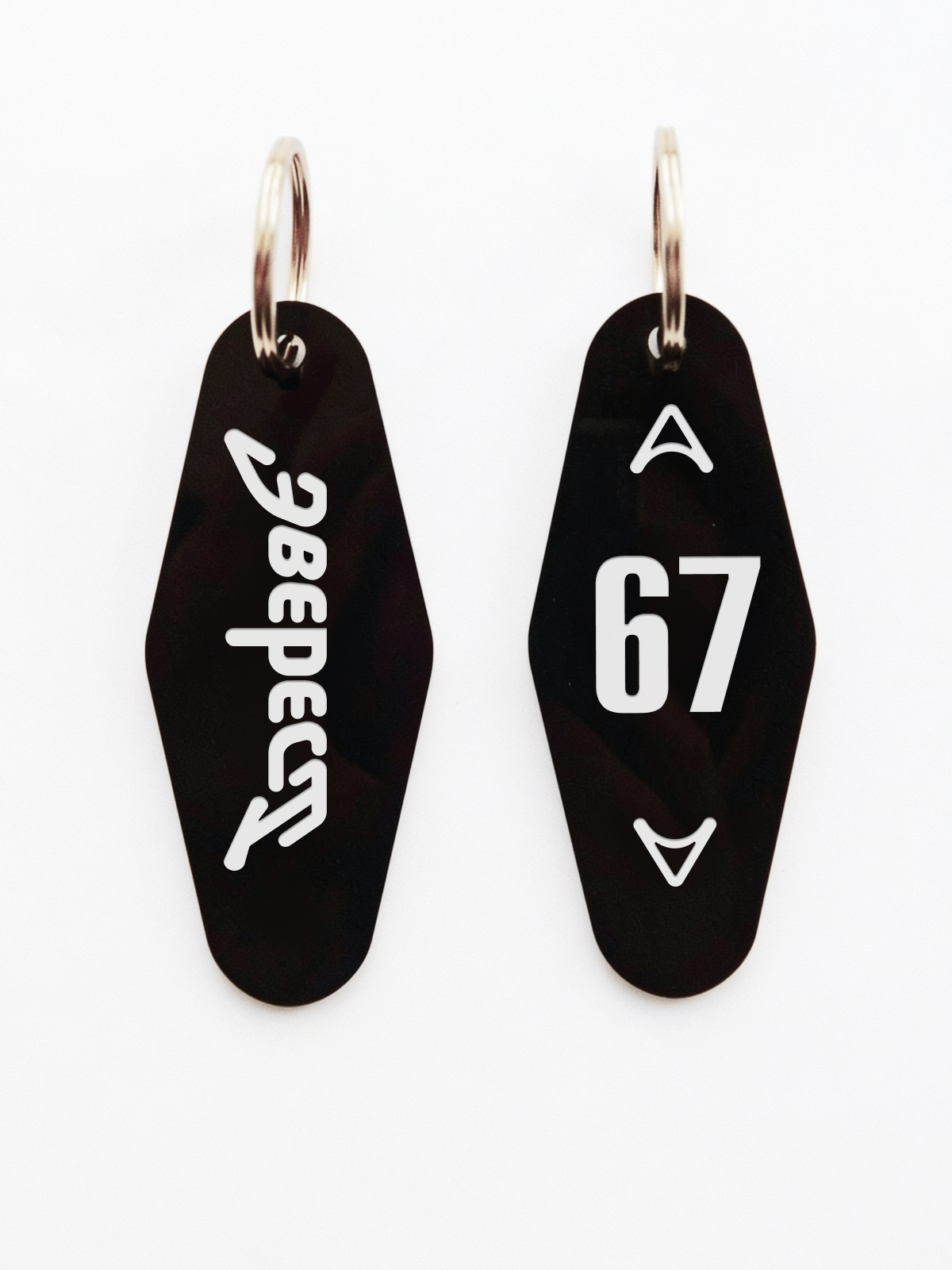
Locker room key tags: on the reverse, the mark is mirrored downward — ascent and descent.
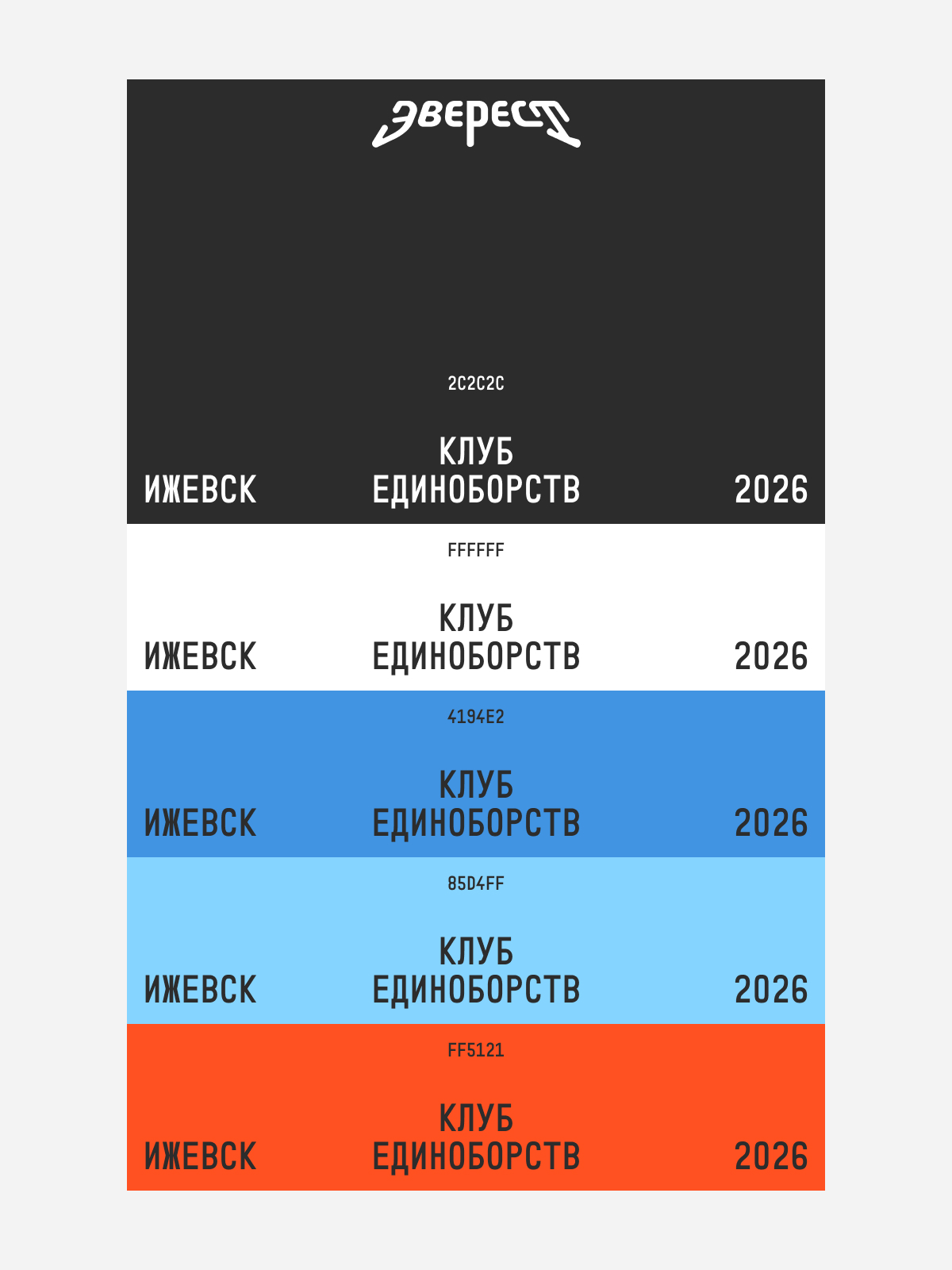
The palette is adapted to high altitude.
Charcoal 2C2C2C, snow FFFFFF, sky 4194E2, ice 85D4FF, and signal orange FF5121.
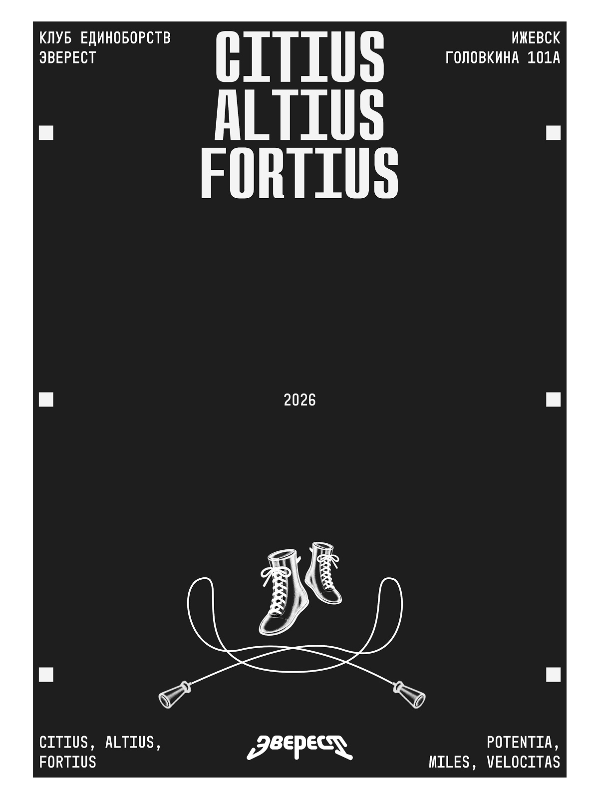
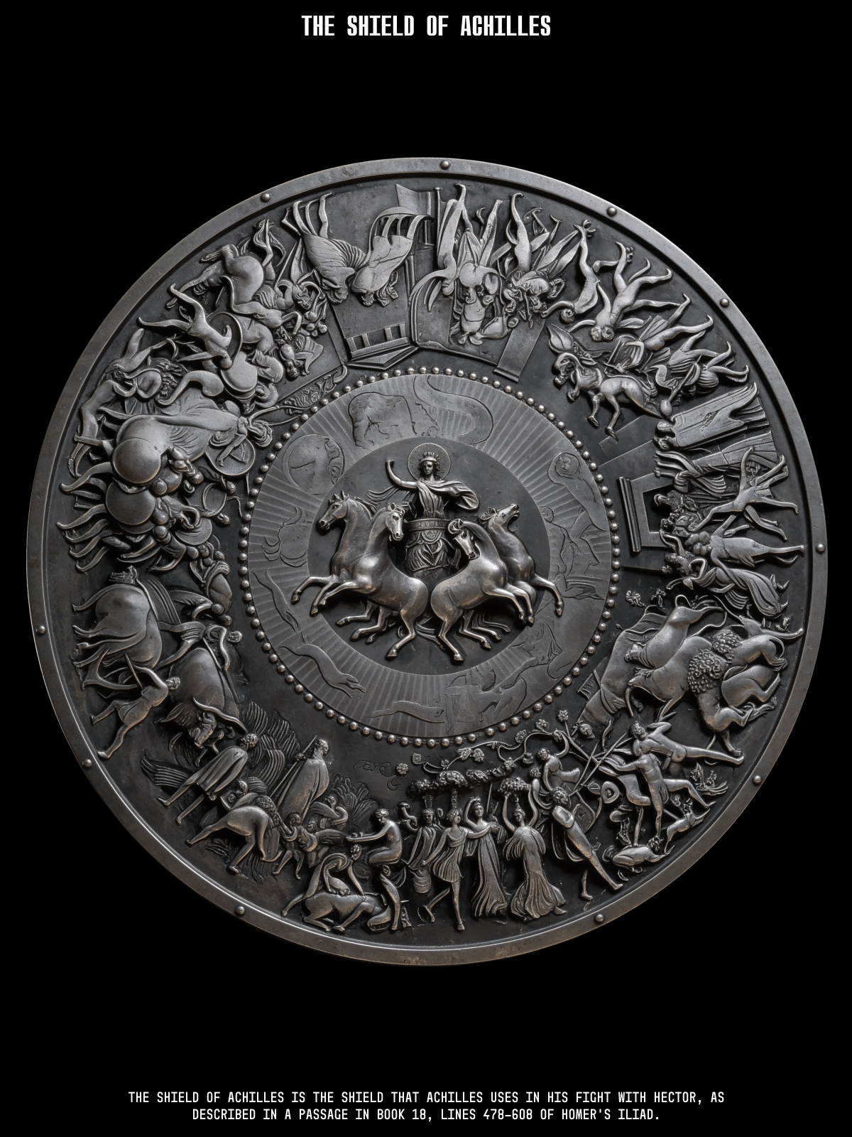
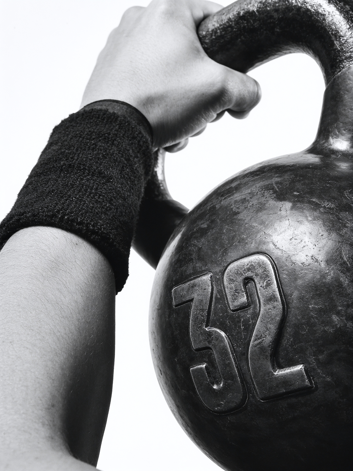
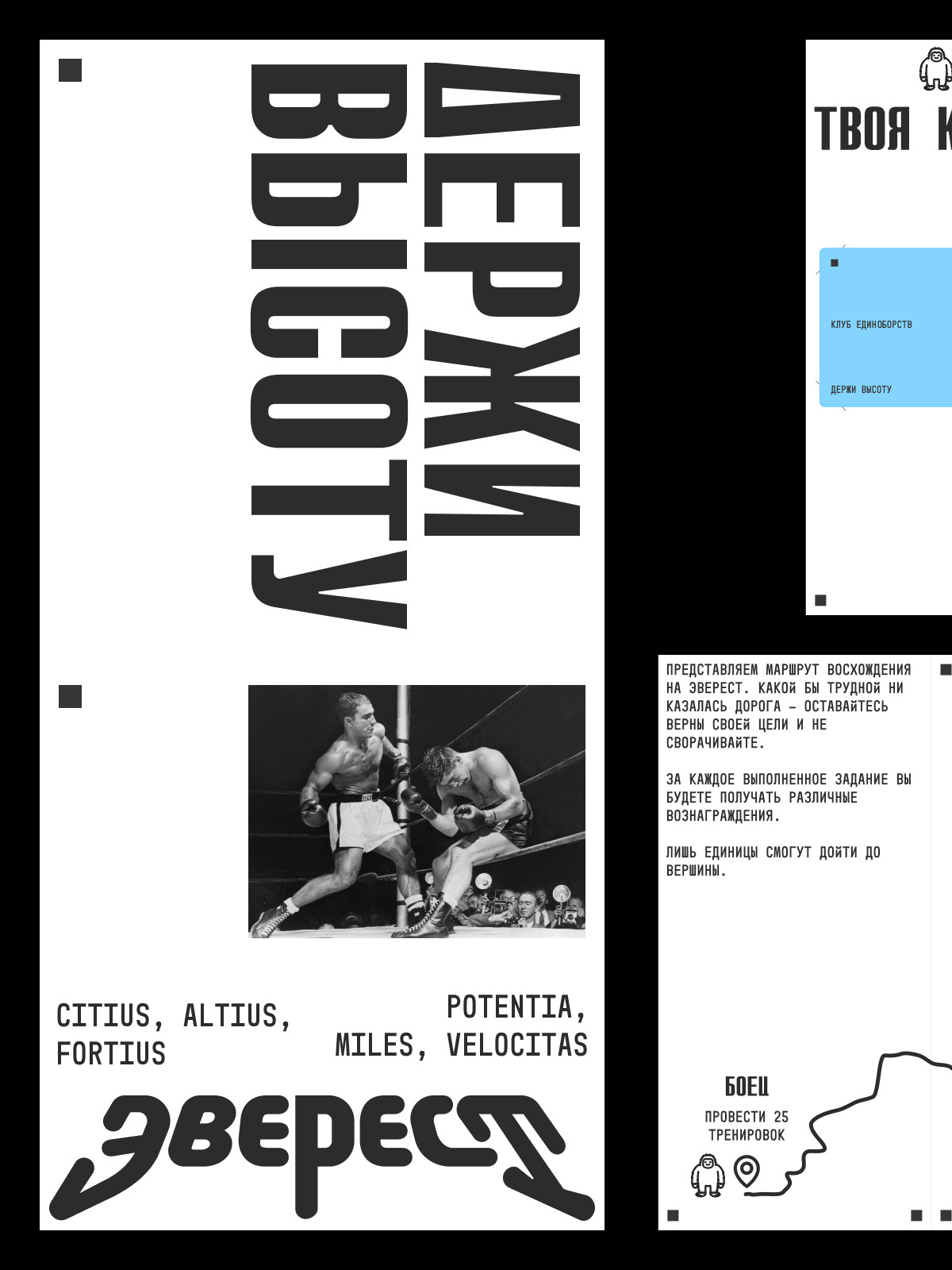
A poster is assembled like a print sheet: a dense display grotesque in caps, monospaced service lines in brackets, crop marks. Inside — vintage engravings and the chronicle of old fights.
Latin mottos set the tone of the series: Citius, Altius, Fortius — Potentia, Miles, Velocitas.

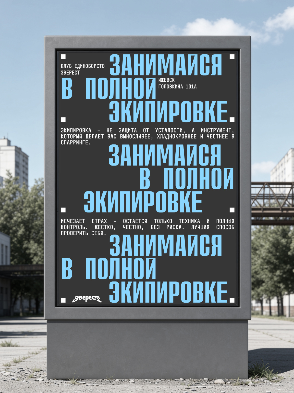
The citylight takes the poster series out into the street.
The website and social media are assembled from the same modules: the poster grid, monospaced lines, and the route line.
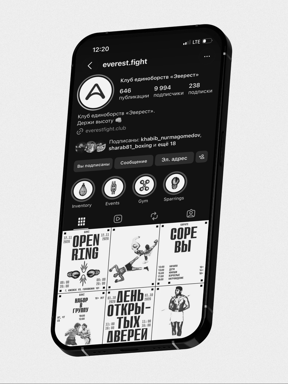
The everest.fight Instagram runs as a feed of posters: events, enrollment, competitions.
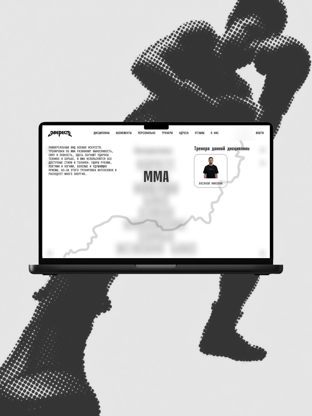
On everestfight.club, a route line runs through the pages; each discipline has its own page with coaches and a trial session sign-up.
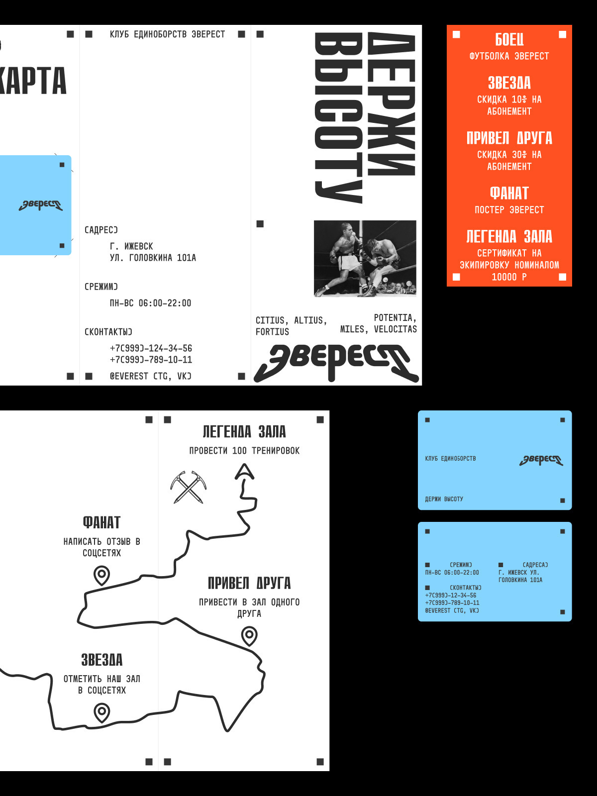
The loyalty program repeats the ascent: the path through the club is marked with statuses and rewards.
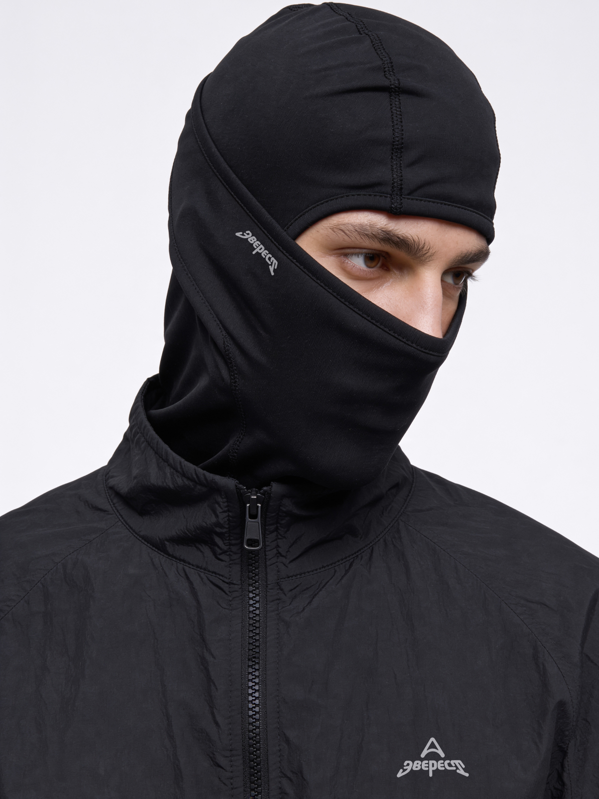
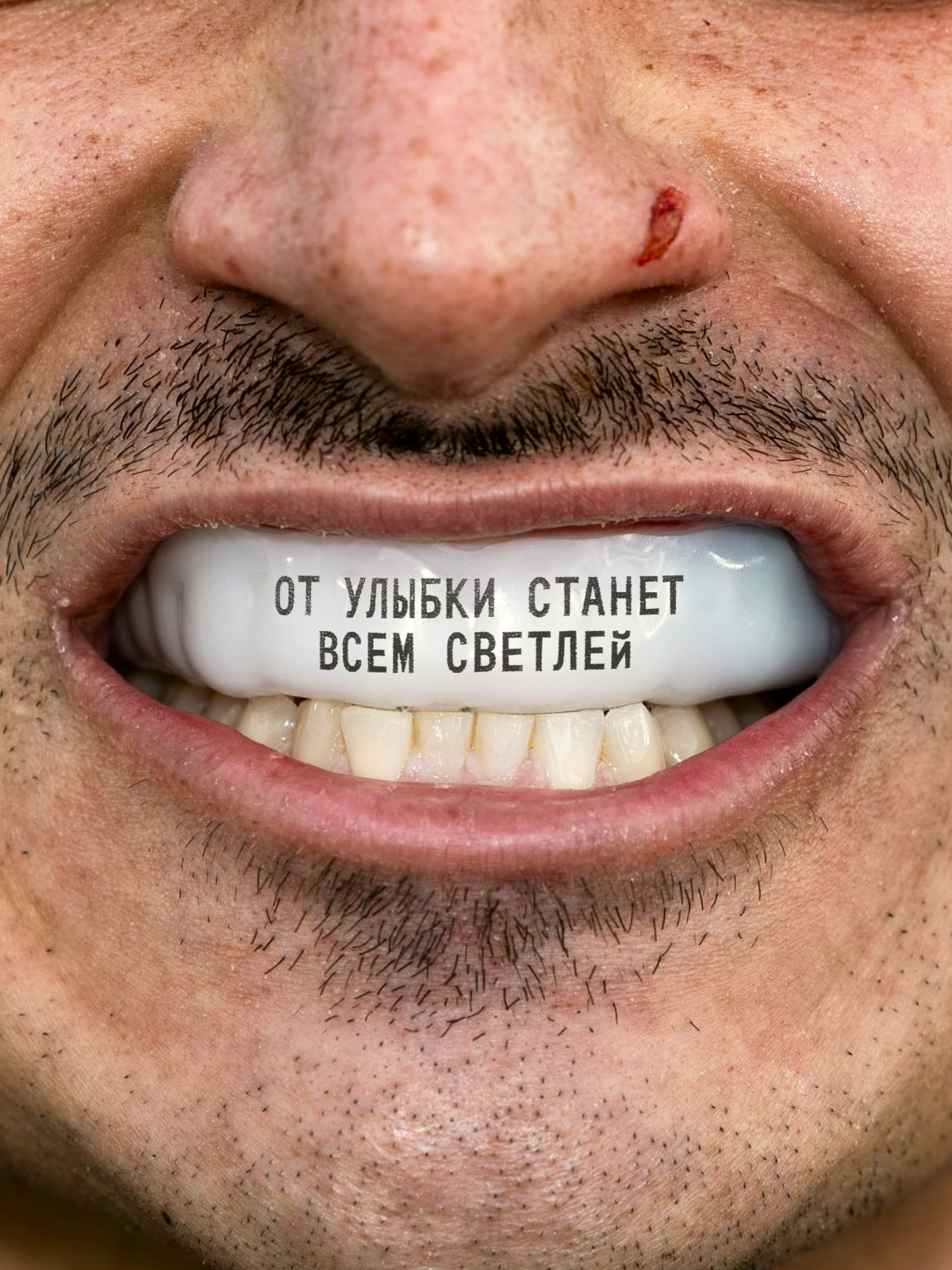
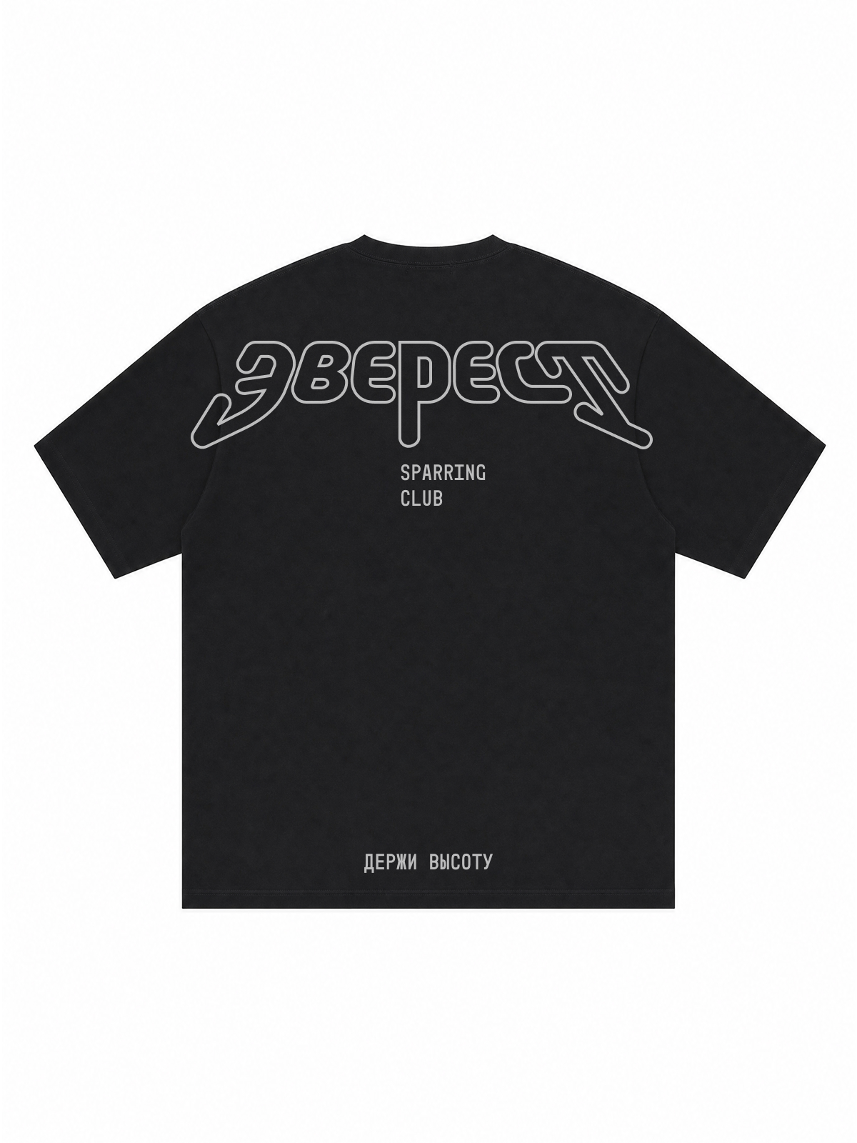
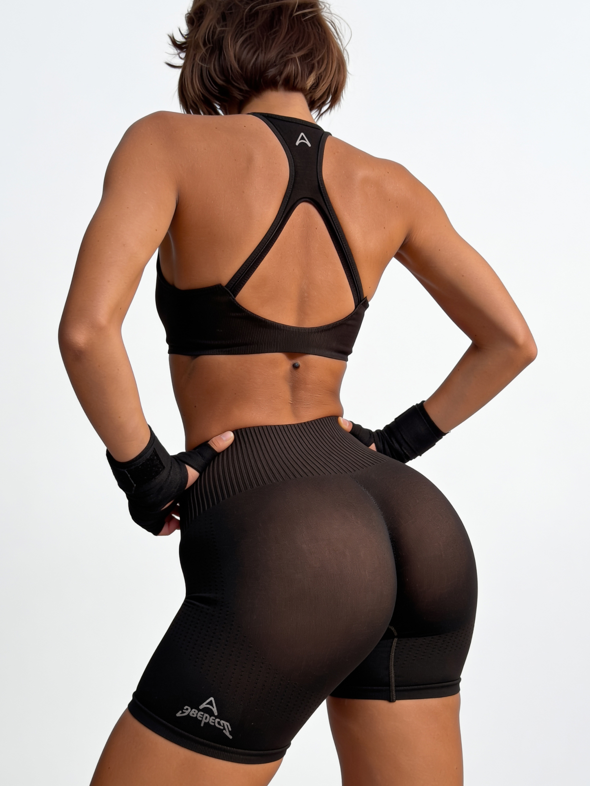
The gear wears the system: the lettering, the mark, and the slogan move onto fabric and plastic.
Reflective lettering on the balaclava and anorak, embroidery on the shorts, prints on the T-shirts and the mouthguard.
Everest is the red dot on the map of the world's peaks. Hold the altitude.

Art direction — Dmitry Grenev.
Design — Vladislav Shadrin, Dmitry Grenev.